You design something vivid on screen, send it to print, and the result comes back a little duller — the bright blue is flatter, the neon green is muted. It is the single most common print surprise, and it is not a mistake by the printer: it is the difference between RGB, the colour world of screens, and CMYK, the colour world of ink. Understanding it takes five minutes and saves a lot of disappointment. This guide explains it. It is part of our complete guide to large-format printing.

Two different colour worlds
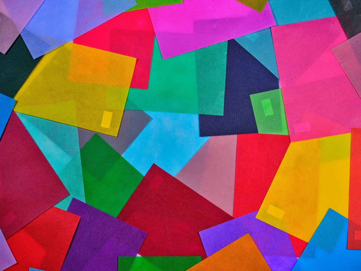
- RGB (Red, Green, Blue) is how screens make colour — by emitting light. Mixing light is additive, and it can produce extremely bright, saturated colours, including glowing neons.
- CMYK (Cyan, Magenta, Yellow, Black) is how printing makes colour — by layering ink that absorbs light. Mixing ink is subtractive, and it has a smaller range, so some bright screen colours simply cannot be reproduced with ink.
Your monitor glows; a banner reflects light. They are fundamentally different ways of making colour, which is why a file can look brighter on screen than it ever will in print.
Why bright colours "lose" in print
The colours most likely to shift are the brightest, most saturated ones — vivid blues, greens, oranges and any neon. These live in RGB but fall outside what CMYK ink can mix, so the printer maps them to the nearest printable colour, which looks a little duller. This is not a fault; it is physics. Knowing it lets you design colours that will survive the trip to ink — choosing strong but printable colours rather than screen-only neons for a PVC banner or roll-up.
Always design in CMYK for print
The fix is simple: work in CMYK for anything that will be printed. Set your document colour mode to CMYK from the start, so what you see on screen is already a (rough) preview of what ink can do — no nasty surprise at the end. If you design in RGB and convert at the end, the bright colours shift then, often unexpectedly. Designing in CMYK keeps your expectations and the result aligned.
Black is a special case
"Black" is another common surprise. Rich black (a mix of all four inks) is deep and dense — use it for large black areas. Pure black (K only, 100% black) is flatter but cleaner for small text. Sending large black areas as K-only can look washed-out; sending small text as rich black can look fuzzy. Set blacks deliberately for the job.
Practical tips for matching colour
- Design in CMYK from the start.
- Don't trust an uncalibrated screen for exact colour — screens vary, and yours may show colours your print cannot make.
- Use brand colours' CMYK values (or Pantone references) so they print consistently across jobs.
- Ask for a proof on colour-critical work — the only way to be sure before a full run.
- Pair careful colour with a UV-stable stock like the premium UV banner so the colour also lasts outdoors.
Our print-ready file setup guide covers colour mode alongside bleed and resolution.
Frequently asked questions
Why does my print look duller than my screen? Screens emit light (RGB) and can show brighter, more saturated colours than ink (CMYK) can reproduce, so the brightest colours shift toward the nearest printable match.
Should I design in CMYK or RGB for print? CMYK — set the document to CMYK from the start so the screen previews what ink can do and there is no surprise at the end.
Why can't my neon colours print? Neon and very saturated colours live in RGB but fall outside the CMYK ink range, so they map to the closest printable, duller colour. Choose strong-but-printable colours instead.
What's rich black vs pure black? Rich black mixes all inks for deep, dense large areas; pure black (K only) is cleaner for small text. Use each appropriately. See the banner range.