Colour management is where print prep gets intimidating: ICC profiles, colour spaces, gamuts, calibration. But for most print jobs you only need a few practical rules, and the theory can stay in the background. This guide gives you the working knowledge without the jargon. It is part of our complete print-prep guide, and it pairs with brand colour consistency.

RGB vs CMYK — the one that matters most
This is the single most important colour concept for print:
- RGB (red, green, blue) is how screens make colour, with light. It can show very bright, vivid colours.
- CMYK (cyan, magenta, yellow, black) is how printing makes colour, with ink. Its range is narrower — some bright RGB colours simply cannot be reproduced.
If you design in RGB and send it to print, those out-of-range colours get converted to the nearest CMYK equivalent, often looking duller than on screen. Designing in CMYK from the start means you see realistic print colours as you work, with no surprise shift.
What an ICC profile actually is
An ICC profile is a small file that describes exactly how a particular device reproduces colour — a specific monitor, printer or paper. It lets colour be translated accurately between devices, so what you see is closer to what prints.
In practice, for most jobs you do not need to manage profiles by hand:
- Work in a standard CMYK profile (your printer can tell you which they prefer; a common general-purpose one is fine if unsure).
- Keep that profile embedded in your print PDF so the printer knows your intent.
Practical rules that cover most jobs
- Design in CMYK for anything going to print — banners, posters, stickers.
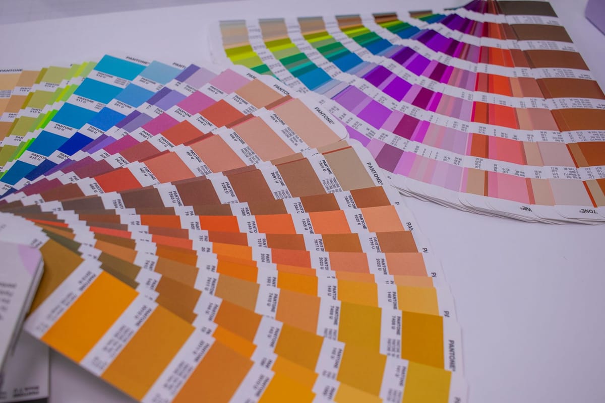
- Specify brand colours in CMYK or Pantone values, not just hex (see brand colour consistency).
- Embed your colour profile in the exported PDF.
- Approve critical colour from a proof on the real material, not from your screen — screens are not calibrated to print.
When to go deeper
For colour-critical work — exact brand colours, photography that must match — ask your printer for their preferred ICC profile and a physical proof, and approve from that. For everyday print, the rules above are enough to avoid nasty surprises. See common print mistakes for related pitfalls.
Frequently asked questions
What's the difference between RGB and CMYK? RGB makes colour with light (screens) and shows brighter colours; CMYK makes colour with ink (print) and has a narrower range. Bright RGB colours can't always be reproduced in CMYK, so design in CMYK to avoid a shift.
What is an ICC profile? A small file describing how a specific device reproduces colour, so colour can be translated accurately between devices. For most jobs, work in a standard CMYK profile and embed it in your print PDF.
Should I design in RGB or CMYK for print? CMYK, from the start — so you see realistic print colours as you work and avoid out-of-range colours shifting on conversion. Specify brand colours in CMYK or Pantone, not just hex.
Why doesn't my screen match the print? Screens use light (RGB) and aren't calibrated to print; print uses ink (CMYK). Approve critical colour from a physical proof on the real material, not your monitor. See the product range.