You have a brand red. On your website it looks right. On one banner it is slightly orange, on another slightly pink, and the stickers came back a different shade again. Inconsistent colour quietly undermines a brand — guests may not name it, but a set that does not match reads as less professional. The good news: colour drift has specific, fixable causes. This guide explains them. It is part of our complete event branding guide.
Why colour shifts: RGB vs CMYK
Screens make colour with light (RGB); print makes it with ink (CMYK). Some bright screen colours simply cannot be reproduced exactly in CMYK ink — the printer maps them to the nearest printable colour, and "nearest" can vary. A vivid screen red often prints slightly duller or warmer. This is the single biggest source of "it doesn't match my screen."
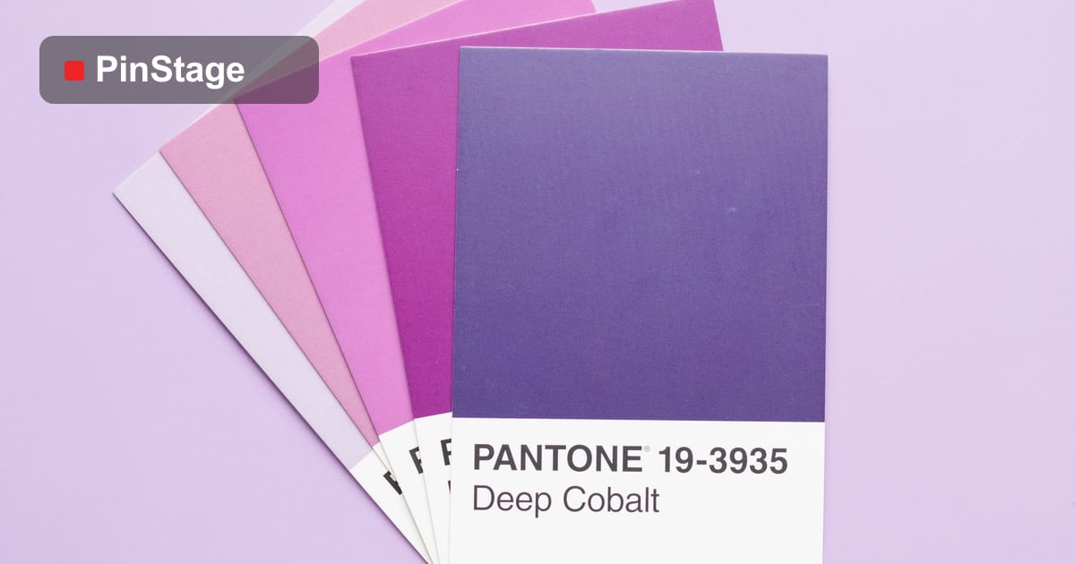
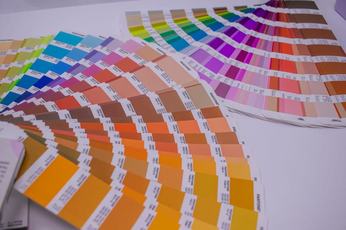
The fix is to specify your brand colour in print terms — a CMYK build or, better, a spot/Pantone reference — rather than assuming a screen value will reproduce. Then every printer has the same target.
Why colour shifts between materials
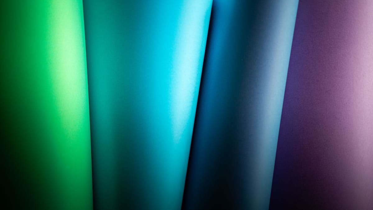
The same ink looks different on different surfaces:
- Matte vs gloss — gloss looks richer and darker; matte looks lighter and softer.
- Fabric vs vinyl vs paper — fabric absorbs ink and mutes colour; vinyl and coated paper hold it brighter.
- Backlit vs front-lit — light behind a material changes how colour reads.
So a fabric backdrop and a vinyl sticker will never look exactly identical — but they can be close enough to read as the same brand if specified well.
How to get consistent colour
- Specify in CMYK or Pantone, not just a hex code — give the printer a print-ready target.
- Print matching pieces together, in one run, from one supplier — the same press and ink batch gives the closest match.
- Ask for a proof on the actual material for critical pieces, and approve colour from that, not from your screen.
- Accept small material differences — aim for "reads the same", not "identical pixel".
For the file side of getting colour right, see colour profiles & ICC and how to make a print-ready PDF.
Frequently asked questions
Why does my brand colour look different on each banner? Mostly RGB-vs-CMYK conversion and different materials. Screens use light, print uses ink, and some screen colours can't reproduce exactly — so each print maps to the nearest printable colour, which can vary.
How do I keep brand colour consistent across print? Specify your colour in CMYK or Pantone (not just hex), print matching pieces together in one run from one supplier, and approve colour from a proof on the real material.
Why doesn't my print match my screen? Screens make colour with light (RGB) and can show colours that CMYK ink can't reproduce. Bright screen colours often print slightly duller — specify a CMYK/Pantone target instead of relying on the screen.
Will fabric and vinyl ever match exactly? Not exactly — fabric mutes colour, vinyl holds it brighter. But with a proper CMYK/Pantone spec they can be close enough to read as the same brand. See the banner range.