Nothing sours an event faster than guests who cannot find the entrance, the registration desk or the right room. Good directional signage is invisible when it works — people simply arrive where they should — and glaring when it is missing, in the form of queues, confusion and stressed staff answering the same question all day. This guide covers the directional signs an event needs and where to put them. It is part of our portable display stands guide.
Map the journey first
Before printing anything, walk the route a guest takes: car park → entrance → registration → main area → rooms/zones → facilities → exit. Every point where someone has to make a decision — a junction, a fork, a door — needs a sign. Map those decision points and you have your signage list. Missing one is where the queue of confused guests forms.
The signs an event needs
- Entrance / welcome — a clear, branded sign so people know they are in the right place. A roll-up banner works well here.
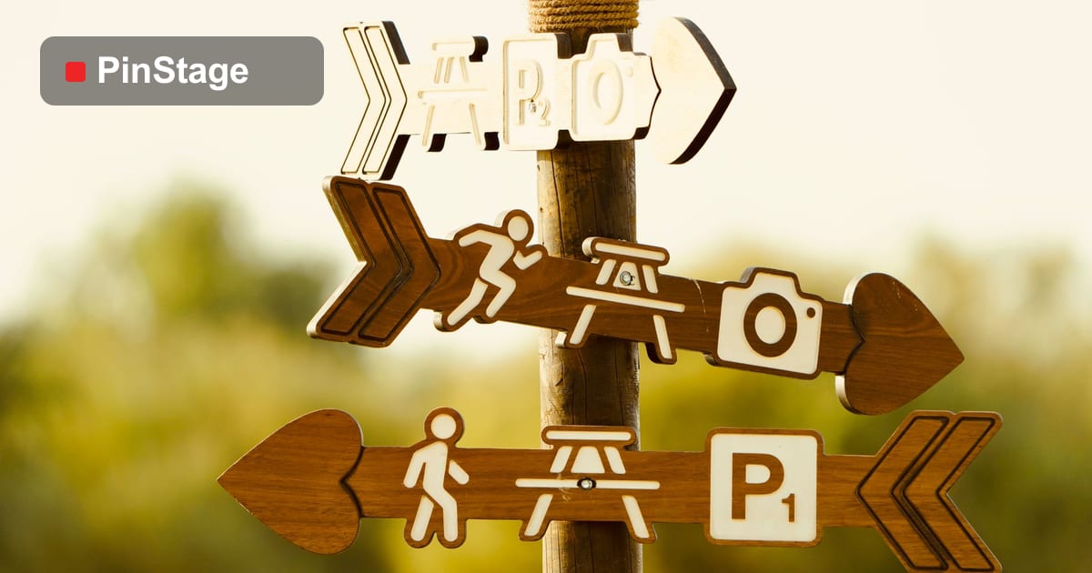
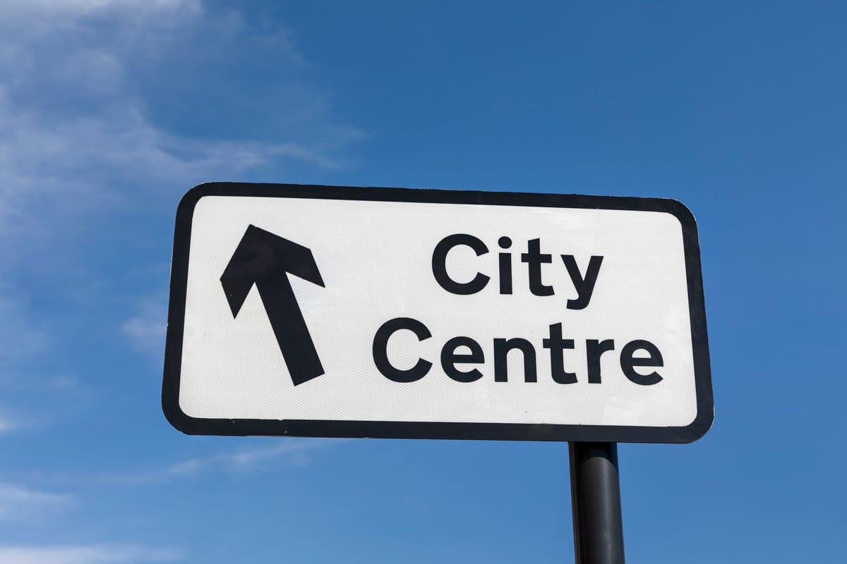
- Wayfinding arrows — "Registration →", "Hall A →" at every junction.
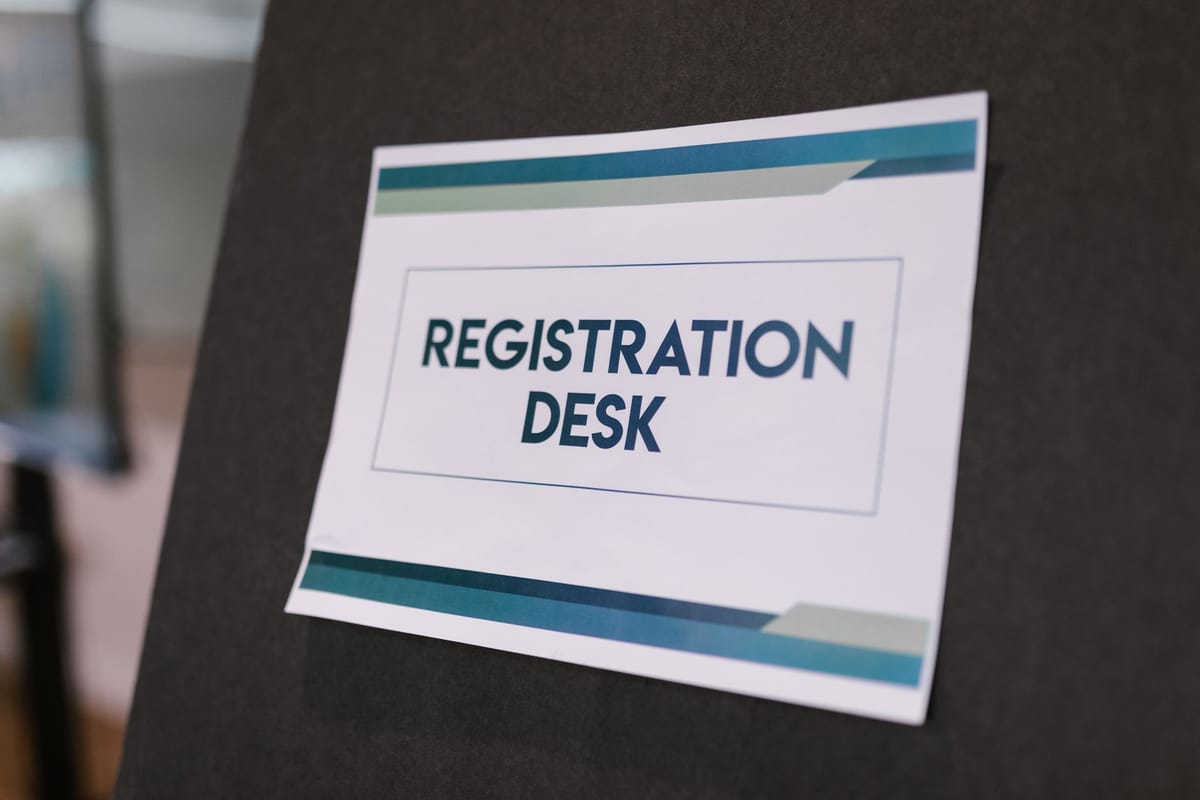
- Registration / check-in — a tall, obvious marker above the crowd so people find the desk.
- Zone and room signs — naming each area and pointing to it.
- Facilities — toilets, cloakroom, exits.
Use a mix of formats: a free-standing A-frame on the floor for arrows, a foamboard sign on a stand for room names, and tall banners where people need to spot a point above the crowd.
Place signs where decisions happen
A sign is only useful at the moment of choice. Put wayfinding arrows at junctions, not halfway down a corridor; place the registration marker where the queue forms, tall enough to see over heads; and repeat key directions if a route is long. Walk the route yourself after setup and fix any spot where you hesitate — if you pause, so will a guest.
Design to read at a glance
Directional signs are read in motion, so clarity beats decoration:
- Big arrows and short labels. "Hall B →" not a paragraph.
- Consistent style across every sign so guests learn to recognise yours.
- High contrast, readable from a distance and at an angle.
- One direction per sign where possible — combining too many destinations on one board slows people down.
Keep the event branding present but let the direction dominate; this is one place where function leads.
Make it reusable
Much event signage can be reused if you design it cleverly. Generic directional arrows, "Registration" and "Welcome" signs work at every event — print them once on durable stands and reuse them, and only print the event-specific names fresh each time. See reusable display tips for more.
Frequently asked questions
What directional signs does an event need? Entrance/welcome, wayfinding arrows at every junction, a tall registration marker, zone and room signs, and facilities signs.
Where should I place directional signs? At every decision point — junctions, forks, doors — and where queues form. Walk the guest route and sign every spot where you would hesitate.
How do I design a directional sign? Big arrows, short labels, high contrast, consistent style, and ideally one direction per sign so it reads at a glance.
Can event signage be reused? Yes — generic arrows and "Registration"/"Welcome" signs reuse across events; only the event-specific names need reprinting. Browse the display range.