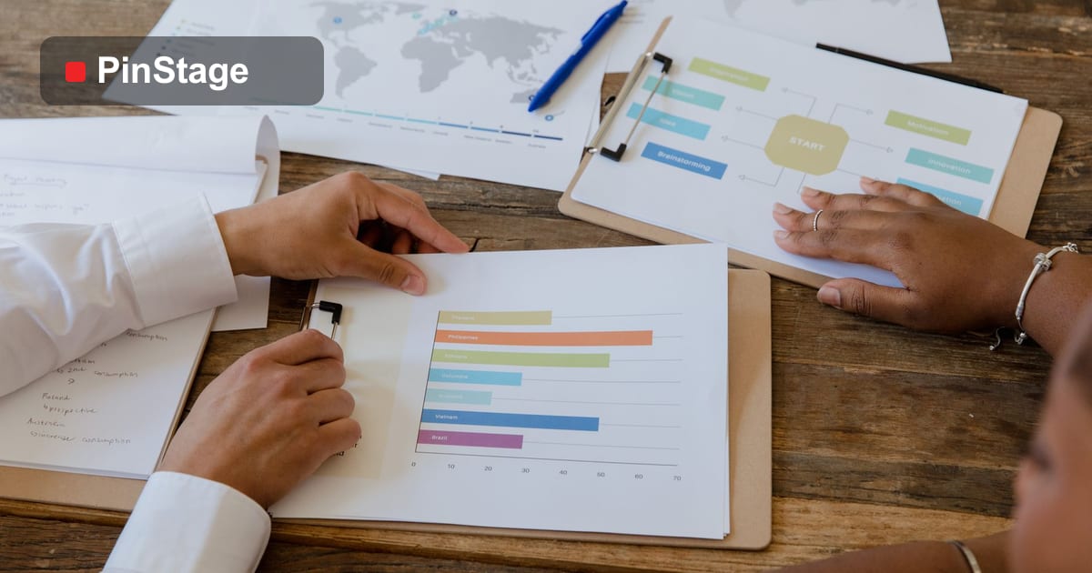
The booths that pull a crowd are rarely the most expensive — they are the clearest, the most visible and the most inviting. Good exhibition design is a set of decisions any exhibitor can make well, regardless of budget. Here are the ideas that consistently turn a passing aisle into a busy stand. It builds on the exhibition marketing guide.
1. Lead with one clear message
The most common design failure is saying too much. A visitor decides in seconds whether to stop, so your backdrop needs one headline — benefit-led, big, and readable from across the aisle. Put your logo high and keep everything else minimal. If a passer-by cannot tell what you do in three seconds, the prettiest graphics will not save the booth. Design your backdrop around that single message.
2. Build up, not just out
Floor space is limited and expensive; vertical space is free attention. Tall backdrops, raised logos and overhead elements get you seen from across the hall, above the crowd. A pop-up wall that uses full height reads from far further away than low table-top signage. Combine a full-height pop-up backdrop with edge banners to own your airspace.
3. Use light to stand out
Exhibition halls are often flat and grey. A well-lit booth instantly looks more premium and draws the eye. Even simple spotlights on your backdrop and logo lift the whole stand. If the venue is dim, lighting is one of the highest-impact upgrades you can make — it makes ordinary graphics look sharp and a crowd feel welcome.
4. Keep the layout open and inviting
A booth that feels like a wall keeps people out. Pull the counter to one side rather than blocking the front, leave a clear way in, and create space for visitors to step into the stand. A branded counter or table positioned to welcome — not to barricade — changes how many people enter.
5. Give people a reason to stop
Visibility gets attention; an interactive hook converts it into a conversation. Options that work:
- A demo of your product, running and visible.
- A prize wheel or simple game like a fortune wheel — fun, social, and a natural lead-capture moment.
- A sample to taste or try (see the food-sampling booth guide).
- A short screen loop showing your work.
The hook does not need to be expensive — it needs to give a reason to pause.
6. Stay ruthlessly on-brand
Your booth should look unmistakably like you. Use your exact brand colours, your real logo, and consistent fonts across every piece — backdrop, banners, counter and handouts. A consistent stand looks established and trustworthy; a mismatched one looks improvised, no matter how much it cost.
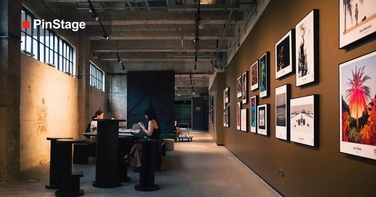
7. Plan for the photo
The best booths get photographed and shared, multiplying your reach for free. Make sure your logo or handle is visible in the natural photo frame — behind where people stand, high on the backdrop. A small design choice turns every attendee's phone into free marketing.
Putting it together on a 3×3
You do not need an island to apply all of this. On a standard 3×3 corner: a full-height branded backdrop with one headline, two edge roll-ups, a welcoming side counter, a simple interactive hook, and a spotlight or two. Clear, visible, inviting — and entirely reusable for the next show.
Common booth-design mistakes to avoid
Most underperforming booths repeat the same handful of errors. Avoid these and you are already ahead of the aisle:
- Too much text. A wall of paragraphs reads as nothing. One headline, big; details in conversation and on handouts.
- Logo too low. Branding hidden behind people's heads disappears in a crowd. Put it high.
- A barricade layout. A counter across the front says "keep out". Open the front and welcome people in.
- No focal point. A flat wall of even content gives the eye nowhere to land. Build one clear hero area.
- Forgetting lighting. A great design in a dim hall looks dull; a few spotlights transform it.
- Off-brand or mismatched pieces. A backdrop, banners and counter that do not match look improvised. Keep colours, logo and fonts identical.
- No reason to stop. Pretty but passive booths get walked past. Add one hook — a demo, a sample, a prize wheel.
None of these cost money to fix — they are decisions, not budget. Get them right and a modest, reusable booth out-performs an expensive one that ignored them.
Frequently asked questions
Do I need an expensive custom build to stand out? No. Clarity, height, light and a good hook beat budget. A reusable fabric system applies every idea here at a fraction of a custom build.
What's the single most important design element? The headline. One clear, benefit-led message readable from across the aisle does more than any graphic.
How do I draw people in on a small booth? Build up (height + logo), keep the front open, and add one interactive hook — a demo, a sample or a prize wheel.
How do I keep it consistent? Use the same colours, logo and fonts on every piece. Start from a coordinated Exhibition & Booth range.