A sign is read in a glance, from a distance, by someone walking past. Good signage design is about being understood instantly — not about looking clever. The rules are simple, but easy to ignore, and getting them right is what separates a sign that works from one that just decorates. This guide covers them, and sits under our retail & event signage guide.
Start with one job
Before any design, decide the one thing the sign must do — brand, direct, or sell — and the one message it must carry. A sign that tries to do everything does nothing well. Everything that follows, from size to layout, serves that single job; if an element does not support it, cut it.
Build a hierarchy
Decide the one thing the sign must say, make it the biggest element, and let everything else support it. A clear order — headline, then supporting line, then detail — lets the eye land in the right place first. Three competing "most important" things means none of them land. Hierarchy is what makes a sign readable in the half-second you actually get.
Maximise contrast
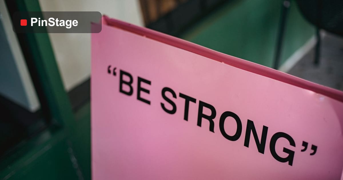
Dark text on a light background, or the reverse, reads from furthest away. Avoid mid-tone on mid-tone, busy photo backgrounds behind text, and colour combinations that vibrate. If in doubt, make it more contrasty, not less — a sign that is comfortable to read up close can be illegible from across a room, and contrast is what carries it the distance.
Choose readable fonts
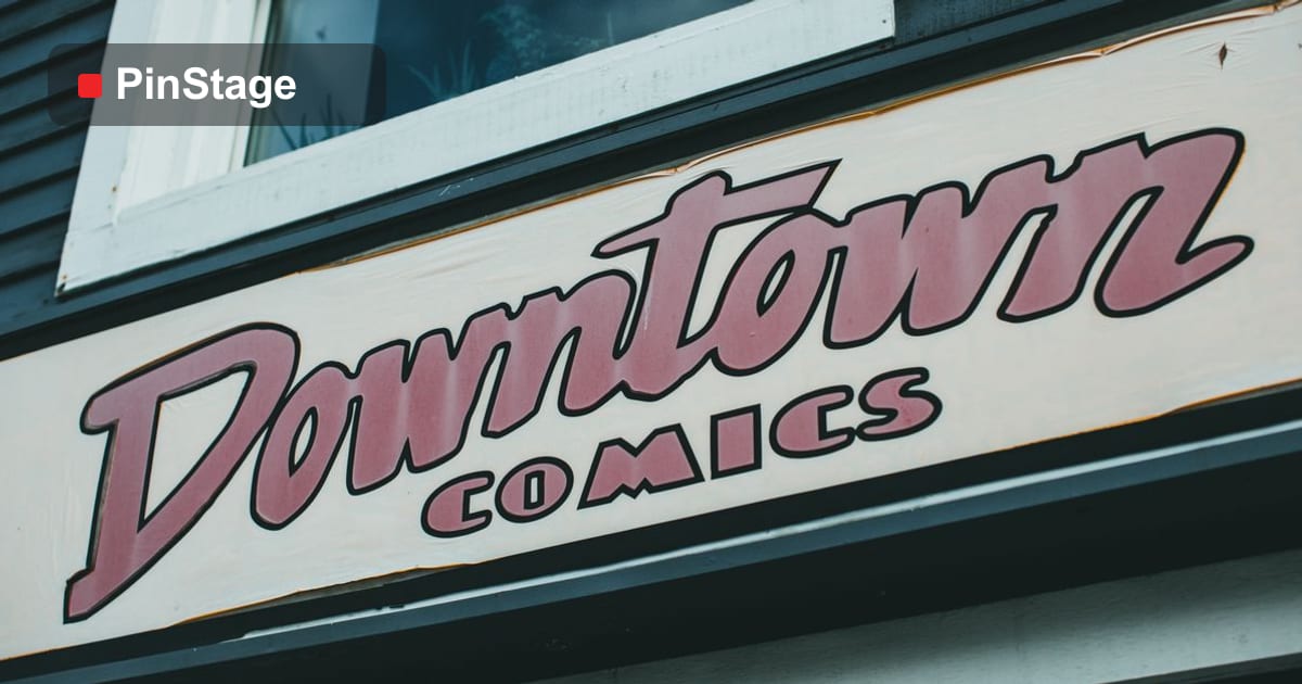
- Clean sans-serifs read fastest at a distance — keep decorative fonts for the logo only.
- Two font weights are plenty; more looks noisy.
- Sentence case or Title Case beats ALL CAPS for anything longer than a couple of words.
- Avoid thin, condensed or script fonts for the main message; they vanish at distance.
Size for the viewing distance
As a rough rule, every 10mm of letter height is readable from about 3–4 metres. A pavement A-stand read at 5 metres needs bigger type than a foamboard sign read at arm's length. Set type to the distance, not to fill the space — the most common signage error is a headline that is too small for where it is read.
Leave white space
Cramming the whole board makes nothing readable. Empty space frames the message and makes it feel considered and premium. If a sign looks a little empty up close, it is probably right at distance. The instinct to fill every gap is what turns a clear sign into a cluttered one — resist it.
Keep it to one job per sign
A roll-up banner that promotes, directs and explains does none of them well. One sign, one job — add another sign rather than another message. A set of focused signs out-performs a single crowded one, and each is cheaper and quicker to read.
Colour and brand consistency
Use your brand colours, exactly, across every sign — three shades of "your blue" and four fonts is the fastest way for a space to look unprofessional. Lock a small palette and one or two fonts, and apply them everywhere. Consistency reads as competence; a jumble of styles reads as a pile of separate jobs, however good each one is.
Words: say less
The fewer words, the faster the sign reads. Cut every word that is not doing work — "We are now open for business" becomes "OPEN". Lead with the benefit or the instruction, drop the throat-clearing, and trust the reader to understand a short, direct message. On a sign, brevity is not just style; it is legibility.
Designing for the medium
A sign's design should suit what it is printed on and how it stands. A tall roll-up is read top-down with the base zone kept clear; a wide banner is read across; a foamboard sign is read up close. Set the artwork up correctly for the product and size — see print-ready file setup — so the design that looks right on screen also works at full size.
Testing your design
Before you print, test the design the way it will be seen: shrink it on screen to roughly the size it will appear at viewing distance, or step back from a printed proof. If the main message is not instantly clear at that size, it is too small, too busy or too low-contrast. A thirty-second test catches the errors that a full print run would make expensive.
Common signage design mistakes
- Too much text. One message beats a paragraph.
- Low contrast. Clever colours nobody can read at distance.
- Type too small. Size to the viewing distance.
- Too many fonts. Two weights, one or two fonts, maximum.
- No white space. Cramming kills legibility.
A quick design checklist
- One job, one message.
- Clear hierarchy — headline first.
- High contrast, readable sans-serif.
- Type sized to the viewing distance.
- Generous white space.
- Consistent brand colours and fonts.
Designing for accessibility
A sign everyone can read is a better sign. High contrast and large, simple type help not just distance reading but people with low vision; avoid colour combinations that are hard for colour-blind readers (red on green is the classic trap), and do not rely on colour alone to carry meaning — add a word or an icon. Clear, accessible signage is not a constraint; it is simply better design that more people can use.
Icons and wayfinding
For directional and wayfinding signs, a clear icon often beats words. An arrow, a symbol for toilets or an entrance, or a simple pictogram is read faster and across languages, which matters in a busy or international space. Pair an icon with a short word where it helps, keep the icon style consistent across all your signs, and people find their way without stopping to read.
Photography and imagery on signs
An image can carry a message faster than text, but only if it is used well. Use one strong, relevant image rather than a collage; keep text off busy areas of the photo or add a solid panel behind it for contrast; and supply the image at full print resolution so it is sharp at size. A great photograph on a sign draws the eye; a small, low-resolution one undermines it.
Briefing a designer
If someone else designs your sign, a clear brief saves rounds of revision. Tell them the one job and message, where and from how far it is read, the product and size, your brand colours and fonts, and any must-include details — a logo, a website, a legal line. The clearer the brief, the closer the first draft, and the less a sign drifts from what it needs to do.
When to keep it plain
Not every surface needs branding, and restraint is part of good design. A space crammed with signs and logos becomes noise; a few well-placed, well-designed signs with clear space around them read as confident and premium. Decide what genuinely needs a sign — a decision point, a key message — and leave the rest clean. Knowing where not to put a sign is as much a design skill as the signs themselves.
A pre-print review
Before a sign goes to print, review it against the basics one last time: one message, clear hierarchy, high contrast, readable type sized to the distance, and generous white space. Step back from a proof or shrink it on screen to viewing size. This final review is cheap; catching a too-small headline or a low-contrast colour after a hundred signs are printed is not.
Consistency across a signage family
The strongest signage rarely comes from one clever sign; it comes from a consistent family of them. When the storefront, the wayfinding, the price boards and the promotional signs all share one palette, one or two fonts and a common layout, the whole space reads as a single, confident brand. Inconsistency is what makes a space feel improvised — three blues, four fonts, a different layout on each sign. Lock a small set of rules once, apply them to every sign, and you get a coherent, professional look that no single beautifully-designed sign can achieve on its own. Designing the system is the work; applying it is what keeps a growing set of signs looking like one brand.
Frequently asked questions
How big should the lettering be? Roughly 10mm of height per 3–4 metres of viewing distance; bigger for a sign read from across a room.
How many fonts should I use? One or two at most, with the decorative font kept to the logo.
What is the most common mistake? Too much text and type that is too small for the distance it is read from.
Set your artwork up with print-ready file setup, and browse displays and signage products.