A menu board is doing more than listing food — it is a silent salesperson. A clear, well-designed board speeds up the queue, guides customers to your best dishes, and quietly lifts the average order. A cluttered, hard-to-read one slows the line, frustrates customers and leaves money on the table. This guide covers designing and printing a menu board that sells. It is part of our retail & event signage guide.
Make it readable first
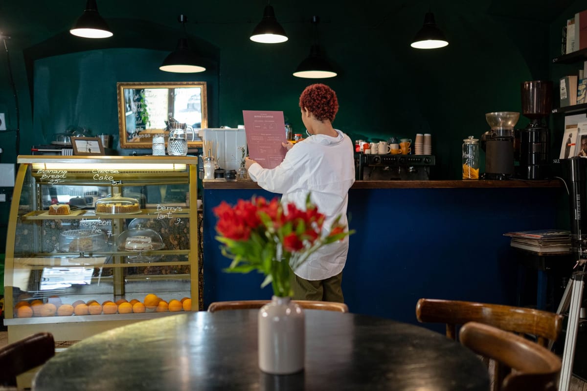
A menu board fails the moment a customer at the counter cannot read it. The basics:
- Big enough type to read from where people queue and order.
- High contrast — light text on dark, or dark on light; avoid low-contrast colour-on-colour.
- Clear sections — group items (Coffee, Cold Drinks, Food) so the eye finds things fast.
- Not too crowded — white space helps people read; a wall of text overwhelms.
A board people read quickly is a queue that moves quickly.
Use hierarchy to sell
A menu board is a chance to guide choices, not just list them:
- Feature your best / high-margin items — give them more space, a photo, or a "signature" tag so the eye lands there first.
- Group logically and order items to lead customers toward what you want to sell.
- Limit choice where you can — too many options slow decisions; a focused board sells more.
Good hierarchy gently steers customers to the dishes that matter to your business.
Materials and formats
Choose based on how often the menu changes:
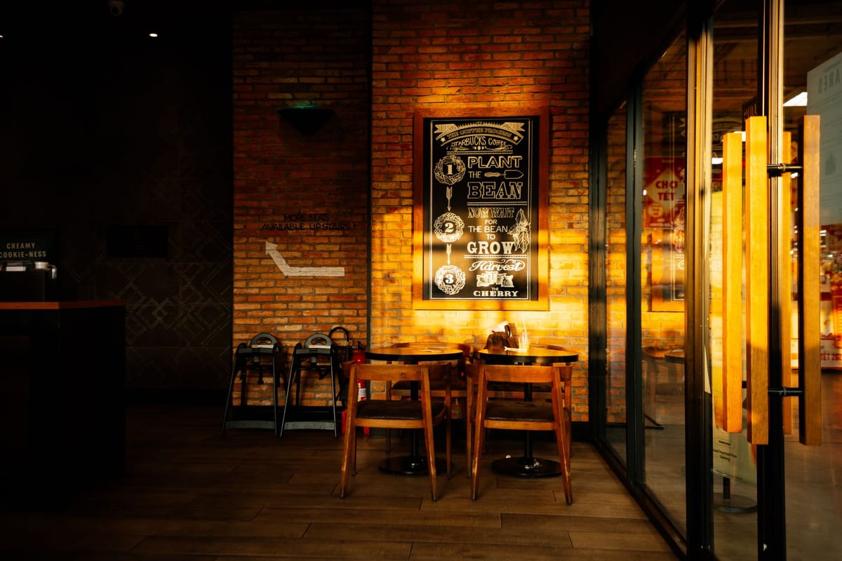
- Printed rigid boards — a foamboard menu or framed poster for a stable menu; sharp, premium and on-brand.
- Window / wall vinyl — vinyl menu graphics applied directly for a built-in look.
- Changeable systems — a frame with a swappable printed panel, or a section for daily specials, if prices and items change often.
Match the format to your menu's stability — a fixed menu suits a printed board; a frequently-changing one needs an easy-update format.
Keep it on brand
Your menu board is a major brand surface that every customer reads. Use your brand colours, fonts and logo so it matches your signboard, packaging and interior. A consistent, well-printed menu board makes a café feel established; a mismatched printout taped to the wall undoes the rest of your branding. Apply the clarity rules from designing effective signage.
A menu-board checklist
- Readable type and high contrast from the queue.
- Clear sections and not overcrowded.
- Hierarchy that features your best/high-margin items.
- Material matched to how often the menu changes.
- On brand with the rest of your signage.
Browse the signage range to print your menu board.
Frequently asked questions
What makes a good menu board? Readable type and high contrast from where people order, clear sections, an uncrowded layout, and a hierarchy that features your best and high-margin items.
How can a menu board increase sales? By featuring high-margin and signature items (more space, a photo, a tag) and guiding choice, it lifts the average order and speeds the queue.
What material should a menu board be? A printed rigid board or framed poster for a stable menu; a changeable frame or daily-specials panel if items and prices change often.
Should my menu board match my brand? Yes — it is a major brand surface every customer reads, so use the same colours, fonts and logo as your other signage. See the signage range.