Signage is how a space speaks when no one is there to explain it — directing, branding and selling at a glance. For a shop, a popup or an event, the right signs turn a blank space into a place that pulls people in and tells them where to go. This pillar guide maps the options — stickers, mounted displays, stands and window branding — and the design rules that make a sign actually work, with deeper how-tos linked throughout.
What signage is for
Before choosing products, be clear what each sign is doing. Most signage falls into three jobs:
- Brand — telling people who you are (storefront name, backdrop, window graphics).
- Direct — telling people where to go (wayfinding, arrows, floor markers).
- Sell — telling people why to act now (promotions, offers, menus).
A sign that tries to do all three usually does none well. Decide the job first, and the product and design follow.
Stickers and decals
The most flexible signage there is: window, floor, wall and vehicle. A vinyl sticker brands almost any smooth surface, one-way vision lets you print a full graphic on glass while customers still see out, and a frosted sticker adds privacy and an etched-glass look. Floor decals with an anti-slip laminate handle footfall and direct traffic underfoot. The full breakdown — surfaces, adhesives and finishes — is in sticker types: window, floor & wall.
Mounted displays
For rigid signs and posters, the mount matters as much as the print. Foamboard is the lightweight workhorse for indoor signage and wayfinding; a printed poster is the cheapest way to put a message on a wall and swap it often; and a canvas print brings a premium, glare-free finish for brand walls and reception art. The comparison — durability, cost and the right setting for each — is in foamboard, poster & canvas.
Sign stands and holders
A sign only works if it stands where people look. An A-stand is the weatherable double-sided pavement sign for outside a shop; an X-stand is the cheap, portable way to hold a banner indoors; and tripod or round-base stands hold a rigid poster at eye level for menus and information boards. Which to use where is covered in display stands: A-stand vs X-stand.
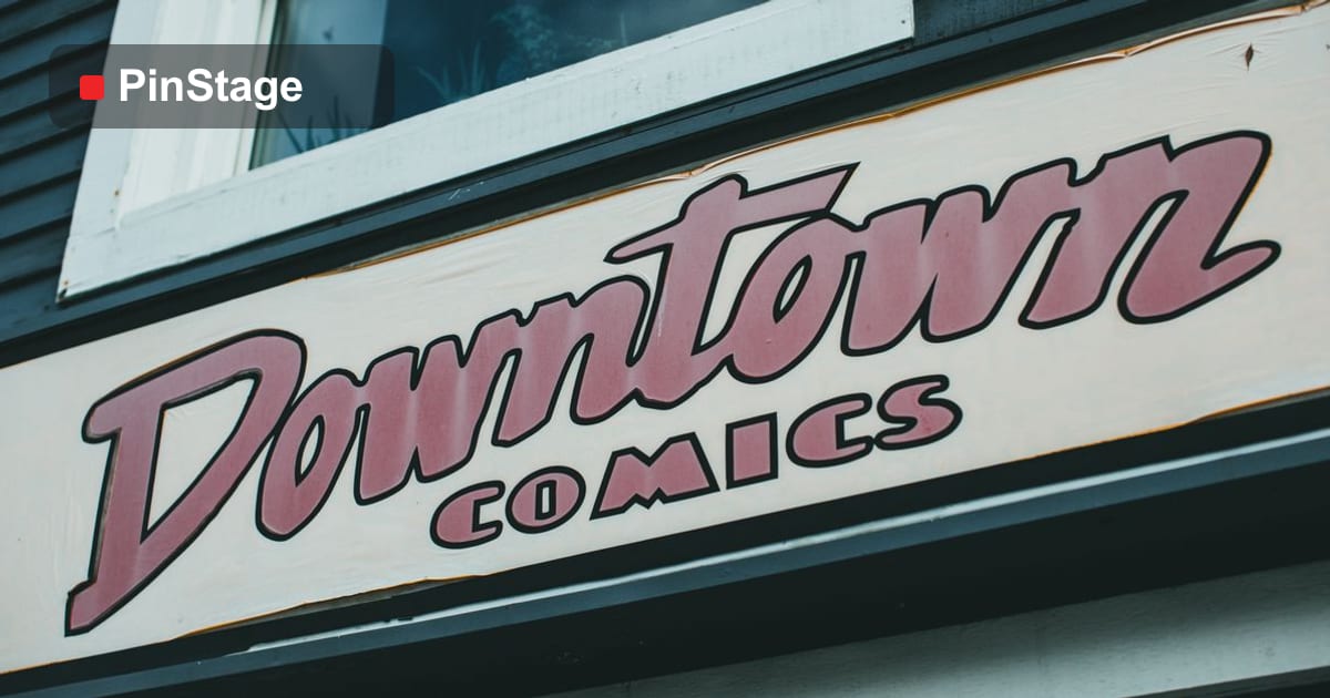
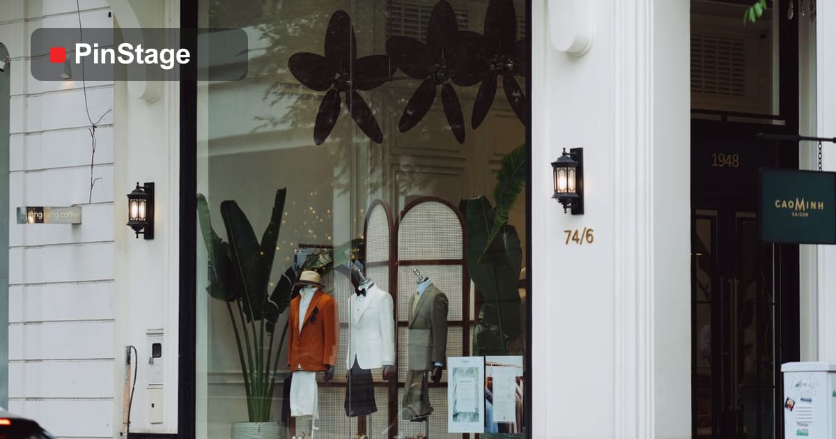
Window and storefront branding
Your window is your most valuable and highest-traffic signage. Used well it pulls passers-by in; used badly it blacks out the glass and looks closed. The trick is to lead with one message at eye level, choose the right film — one-way vision for big graphics, frosted for a premium look, decals for cut letters — and leave clear glass so people can see the life inside. The full method is in storefront window branding.
Designing signage that reads
A sign has seconds to be understood, from a distance, by someone walking past. The rules are simple but easy to ignore:
- Hierarchy — one biggest element, everything else supporting it.
- Contrast — dark on light or light on dark; avoid mid-tone on mid-tone.
- Readable fonts — clean sans-serifs, two weights at most, no ALL CAPS for long text.
- Size for distance — roughly every 10mm of letter height is readable from 3–4 metres.
- White space — empty space frames the message; cramming kills it.
The full treatment, with examples, is in designing effective signage.
Indoor vs outdoor signage
Indoor signs have an easy life and can prioritise finish and print quality. Outdoor signs face sun, rain and wind, so they need weather-ready materials — anti-slip floor laminate, UV-stable print, a weighted A-stand rather than a light X-stand — and fixings that hold. As with banners, the first question is always "where will it live, and for how long?"
Planning a shop or popup sign system
Rather than buying signs piecemeal, plan them as a system so they look like one brand:
- Storefront: window decals or one-way vision plus an A-stand for the pavement.
- Inside: foamboard wayfinding and posters for promotions.
- At the till or counter: small standing signs for offers and payment options.
- For a popup: add roll-ups and floor stickers that lift cleanly at the end.
Order them together, in matching colours and fonts, and a small space reads as an established brand.
Common signage mistakes
- Too much text — a sign read in two seconds cannot carry a paragraph.
- Low contrast — clever colour combinations nobody can read at distance.
- Blacked-out windows — they look closed; frame the view instead.
- Wrong adhesive or material — a removable promo on permanent vinyl, or fabric where you needed weatherproof.
- No plan — signs bought one at a time rarely match.
Matching signage to the customer journey
Think about what a customer sees, in order, from the street to the till, and put a sign at each decision point:
- Approaching — the storefront and window: who you are and why to come in.
- Entering — a welcome or featured offer just inside the door.
- Browsing — wayfinding and category signs that help people find things.
- Deciding — promotions and information beside the product.
- Paying — offers, loyalty and payment options at the counter.
Mapping signs to the journey stops you over-signing one area and leaving another blank, and turns a set of separate signs into a path that guides people all the way to a purchase.
Vehicle and fleet graphics
Your delivery van or car is a moving billboard that works every time it is on the road. Vehicle graphics range from a simple cut-vinyl logo and phone number to a full wrap, and the key is a conformable cast vinyl that stretches over curves and door seams without lifting. Keep the message readable at traffic speed — name, one service, a phone number or short URL — and place it where it is seen at junctions and in car parks, not hidden on a lower panel.
Lighting and visibility
A sign nobody can see does not work. Outdoor and evening signage often needs help: a backlit lightbox film glows after dark, reflective vinyl catches headlights, and even simple placement near existing light makes a difference. Indoors, make sure your signs are not lost against a busy wall or in shadow — contrast with the background, not just within the sign.
Keeping signage on-brand
The fastest way for a space to look unprofessional is mismatched signs — three fonts, four shades of your brand colour and a different layout on each. Lock a small system before you print: one or two fonts, exact brand colours in CMYK, a consistent logo placement and a shared layout grid. Apply it to every sticker, poster and stand and the whole space reads as one considered brand rather than a pile of separate jobs.
A signage maintenance routine
Signs age in public, so a little upkeep protects the impression they make. Wipe window graphics and lightboxes so they stay bright; replace any peeling sticker edges promptly, because one lifting corner makes the whole shop look neglected; refresh promotional posters the moment the offer ends; and re-tension or re-seat any stand that has been knocked. A five-minute weekly check keeps signage looking new far longer than it otherwise would. Keep your print-ready files too — reordering is then a five-minute job, not a redesign.
A quick signage buying checklist
Before you order, run through five questions: What is the sign's one job — brand, direct or sell? Where will it live, and for how long? Indoor or outdoor, and does it need weatherproofing? Permanent or removable? And does it match the rest of your signage system? Answer those and the product, material and finish all fall into place, and the linked guides cover any decision in detail.
Frequently asked questions
What is the most cost-effective signage? Stickers and posters give the most message per ringgit; reuse a foamboard or A-stand frame and swap the print.
Can I remove stickers cleanly later? Yes, if you order a removable adhesive — essential for short-term promos and popups.
How big should the lettering be? Size to the viewing distance: roughly 10mm of height per 3–4 metres of reading distance.
How long do window stickers last? Interior-applied vinyl can last years; exterior graphics in strong sun fade sooner — choose a UV-stable film for anything long-term outdoors.
Indoor or outdoor adhesive — does it matter? Yes. Outdoor and floor applications need specific adhesives and laminates; using an indoor sticker outside is the most common reason signage fails early.
Should I install it myself? Most stickers and stands are a do-it-yourself job — clean the surface, work centre-out with a squeegee, and take your time. For a large window graphic, a vehicle wrap, or high outdoor fixings, a professional install is worth it: a crooked, bubbled result on public display costs far more than the fitting.
Browse stickers, displays and signage products, set your artwork up with output specs, and follow the linked guides for any piece you are unsure about.