A great promotion is wasted if nobody notices it. Sale and promotion signage is the bridge between an offer and a sale — it stops passers-by, communicates the deal in a glance, and pulls people through the door. Done well, it turns existing foot traffic into revenue at very low cost; done vaguely, the offer goes unseen. This guide shows how to make sale signs that actually sell. It is part of our retail & event signage guide.
Lead with the offer, big
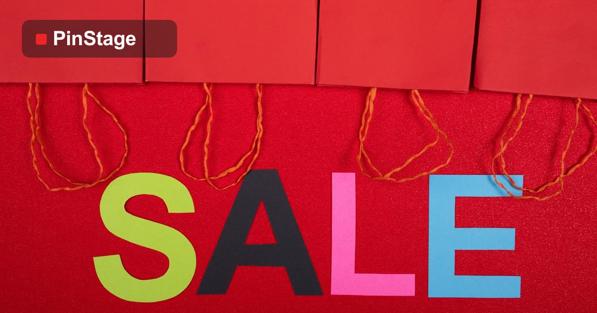
The single rule of sale signage: the offer is the hero. "50% OFF", "Buy 1 Free 1", "RM9.90 Deal" — big, bold, and readable from across the street. People decide in a glance whether a sale is worth crossing the road for, so the number or the deal must dominate the sign. A window poster or a PVC banner with one giant offer out-pulls a sign cluttered with terms and conditions every time.
Place it where it stops people
A sale sign works only where people see it before they walk past:
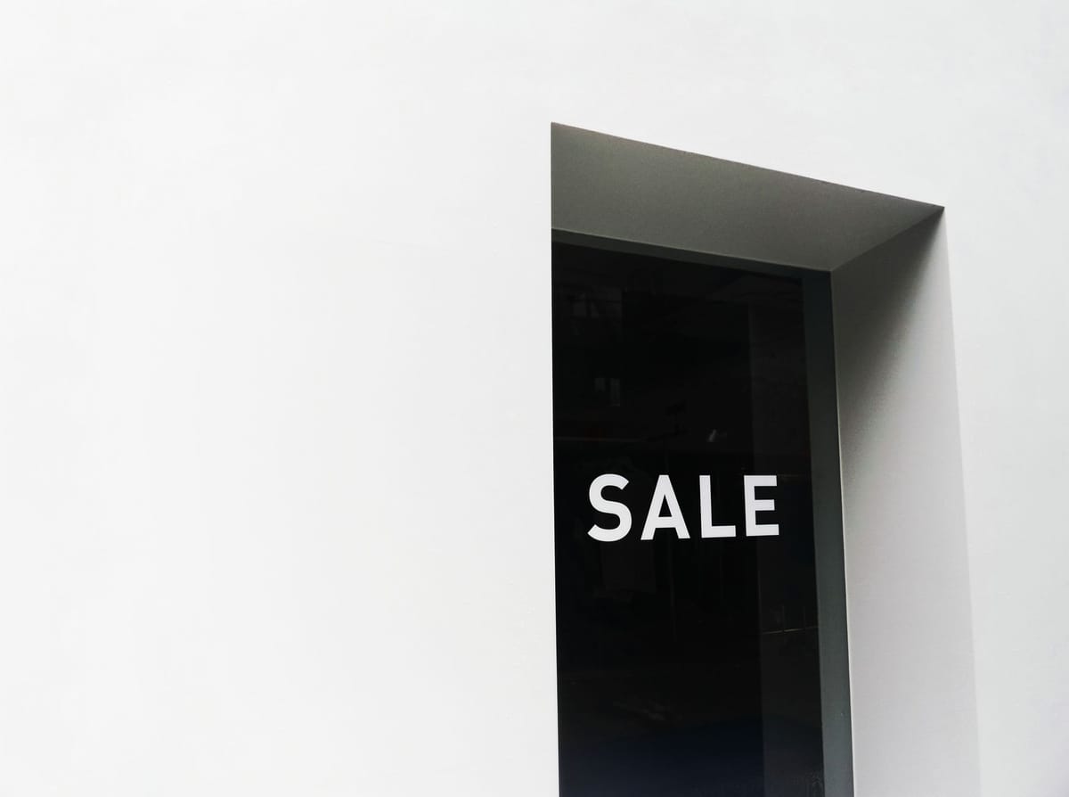
- The window — the highest-traffic surface; vinyl stickers or posters facing the street.
- The frontage — a banner across the shop for a big sale.
- The entrance — an A-frame or a sign at the door so undecided passers-by step in.
- In-store — at the point of decision, near the product or the till.
Put the offer in the line of sight of someone walking past, not somewhere they only see once they are already inside.

Create urgency
Sales convert better with a reason to act now:
- A deadline — "This Weekend Only", "Ends Sunday".
- Scarcity — "While Stocks Last".
- A clear, simple deal — one offer people grasp instantly beats a complicated multi-tier promotion.
Urgency turns "maybe later" into "let's go in now".
Keep it on brand (but loud)
Sale signage can be bold and still look like you. Use your brand colours and logo, but let the offer dominate — red and high-contrast colours grab attention and signal "deal". A sale sign that matches your brand looks intentional; a clashing one looks desperate. Apply the clarity rules from designing effective signage.
Make recurring promos reusable
If you run regular sales, design for reuse:
- A reusable frame or banner with a changeable offer panel.
- Window stickers that come off cleanly (removable vinyl) so you can swap each season.
- A template so each new promo drops into the same layout, fast.
This keeps every sale looking sharp without reprinting everything each time.
A quick sale-signage checklist
- One bold offer, readable from the street.
- Placed in the window, frontage, entrance and at the product.
- Urgency — a deadline or scarcity.
- On brand, high contrast.
- Reusable formats for recurring promos.
Browse the signage range to set up your next promotion.
Frequently asked questions
What makes good sale signage? One bold offer as the hero, readable from across the street, placed where people see it before they pass, with urgency (a deadline) and on-brand high-contrast design.
Where should I put sale signs? In the window, across the frontage, at the entrance and at the point of decision in-store — anywhere a passer-by sees the offer before walking past.
How do I create urgency? Add a deadline ("This Weekend Only") or scarcity ("While Stocks Last"), and keep the deal simple enough to grasp instantly.
Can I reuse promotion signage? Yes — use a reusable frame or banner with a changeable offer panel, and removable window vinyl, so each sale swaps in cheaply. See the signage range.